Corporate Branding for MEMES 迷母品牌視覺
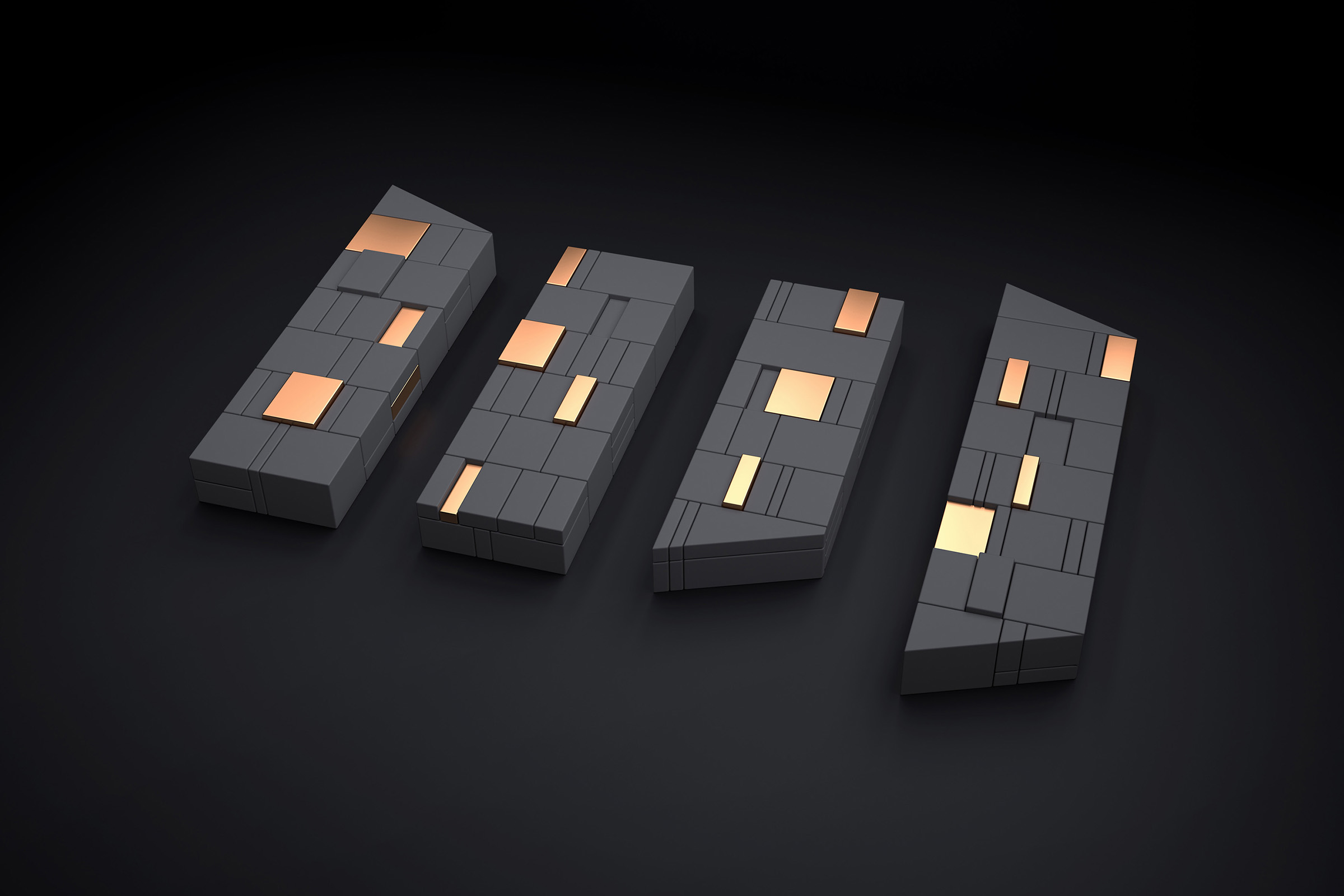
四條線條,分別代表著商品、平面、角色、企劃 等服務;隱藏著m在裡頭,是意函創意、趣味、專業、冒險的迷母精神。
MEMES develops the corporate identity by redesigning its visual identity. The letter M on the corporate visual design represents MEMES. The four lines on the corporate visual design implies the services MEMES provides which are graphic designing, product and character designing, and business planning. They are also the four important MEMES spirits and characteristics, creative, fun, professional and adventurous.
立四本の柱はそれぞれグラフィック、キャラクター、企画などのサービスを意味します。ロゴに含まれている“M”の意匠はクリエイティブ的、趣的、匠的そして冒険的なMEMESのスピリットを示しています。
- Client迷母國際
- Designer趙彥傑
- Creative Director趙彥傑
- 2014