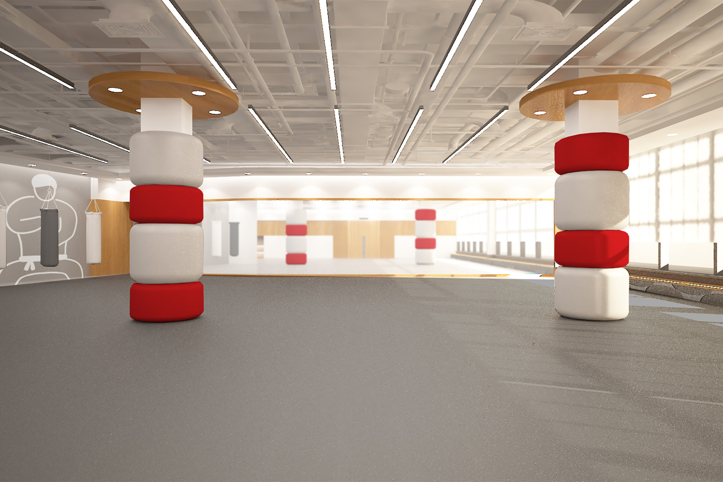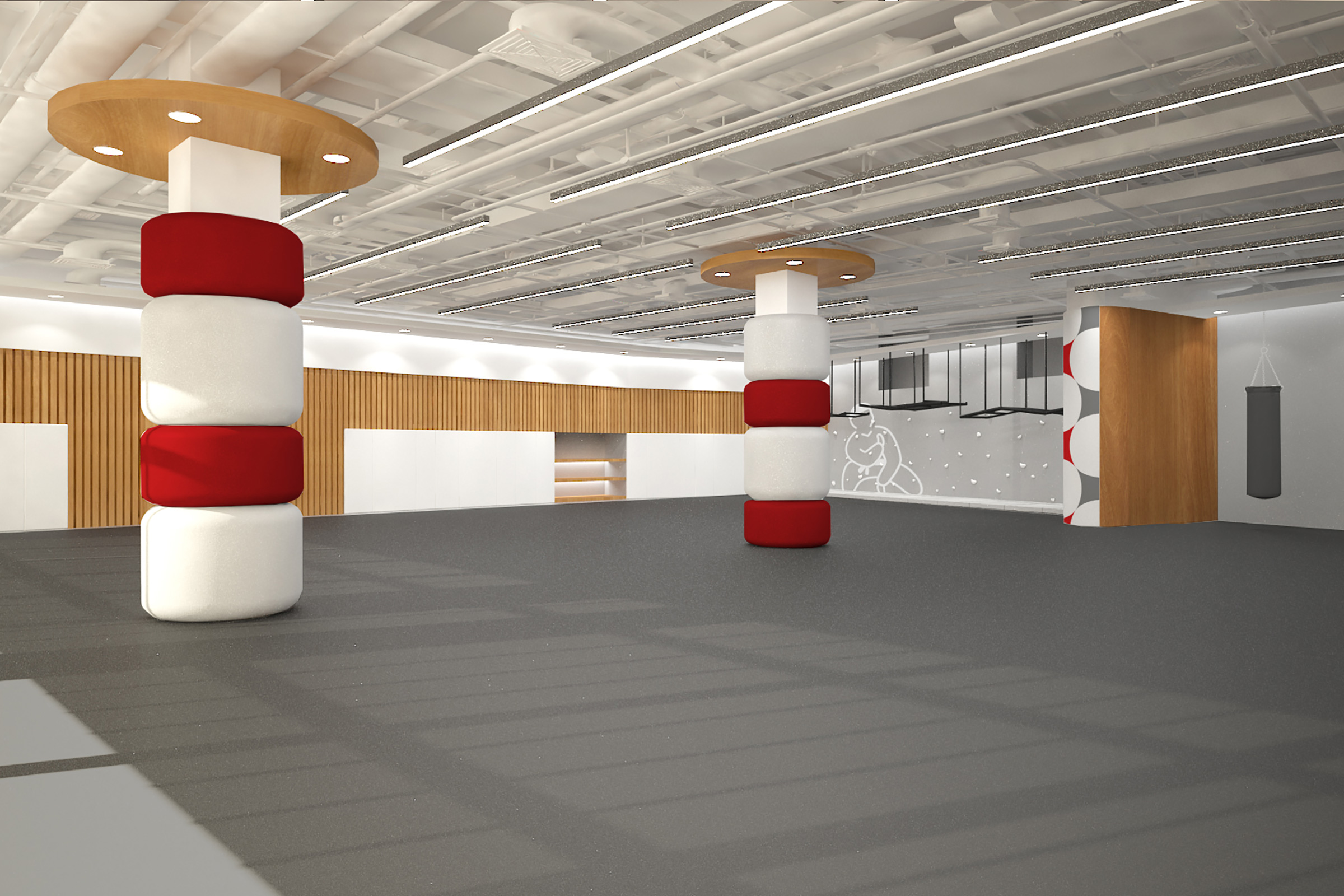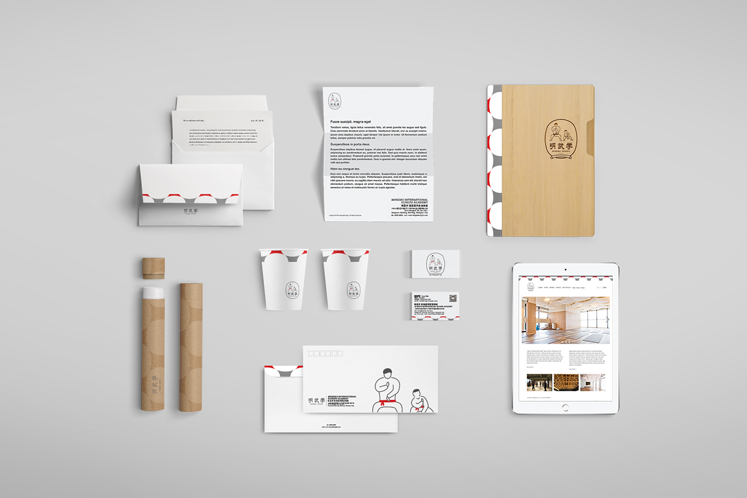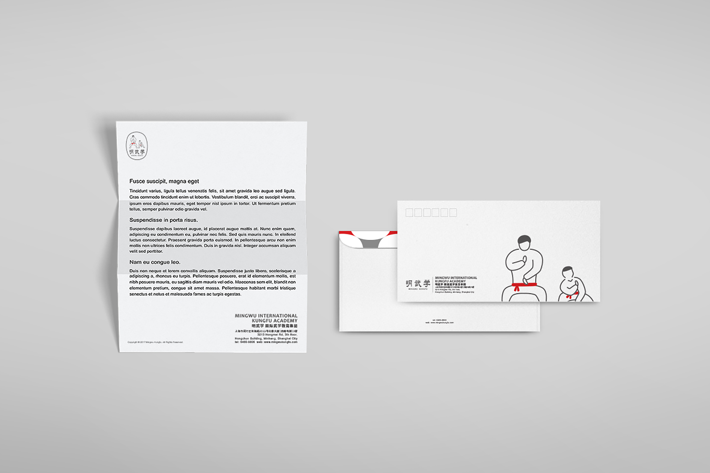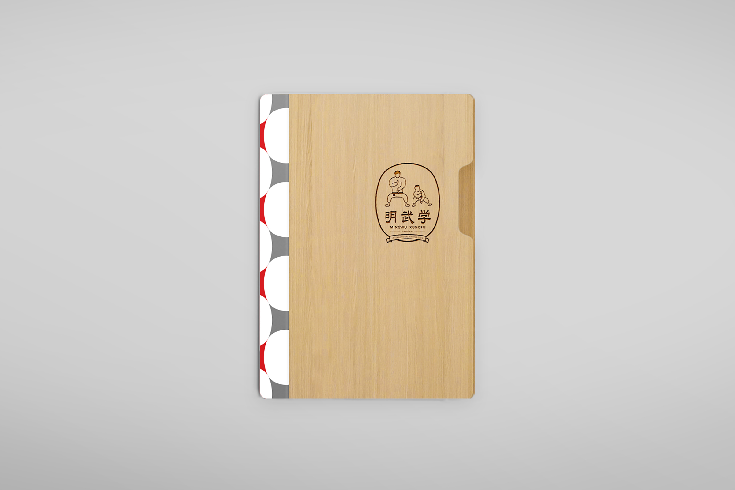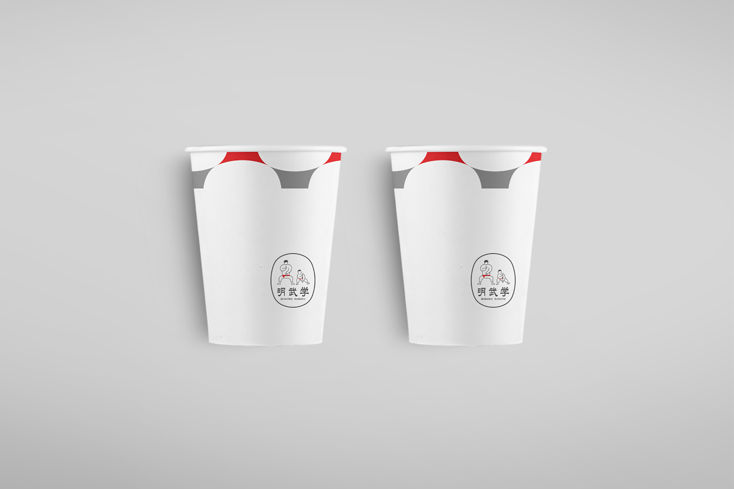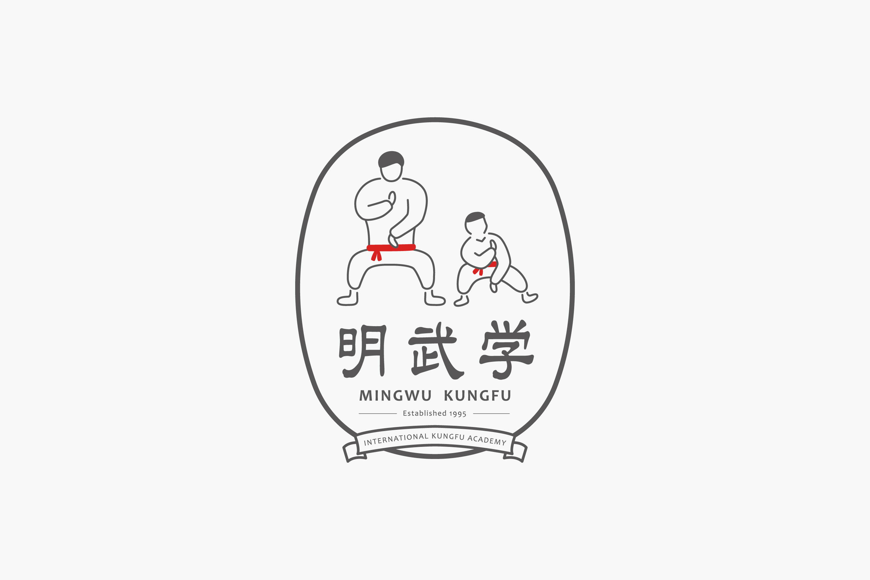
這次替中國兒童武術學校-明武學,打造企業識別與空間規劃,概念以孩童歪扭身子試著揣摩大人的武術動作之青澀模樣,象徵武術學習是循序漸進,不分年齡;空間方面,以簡約俐落的設計方式,將明武學企業識別色-紅白灰恰當融入,打造舒適、安全、具有現代感的習武空間。
MEMES develops corporate identity including its space planning for MingWu. The corporate identity design is developed as a kid is learning a martial arts move to represent the vision MingWu, learning martial arts should be step by step despite ages. For its interior design planning, MEMES uses modern interior style blends in MingWu’s signature colors, red, white, and gray to create a comfort, safe and modern learning environment for all learners.
中国の子供功夫スクールー「明武学」に依頼された案件です。
企業CIに武術の仕草を懸命に練習する子供の姿を表しています。
武術の学習はステップバイステップ、年齢問わず地道に進むしかならず精神を融合することに試み、空間の方はシンプルに赤と白の企業ビジュアル色を使用しました。落ち着きのある且つ安全でモダンな功夫学習空間を実現しています。
- Client上海明武學
- Designer林東泰
- Creative Director趙彥傑
- 2017