Packaging Design – We Sweet × Reese's Co-branding Desserts We Sweet X Reese’s 花生醬聯名包裝設計
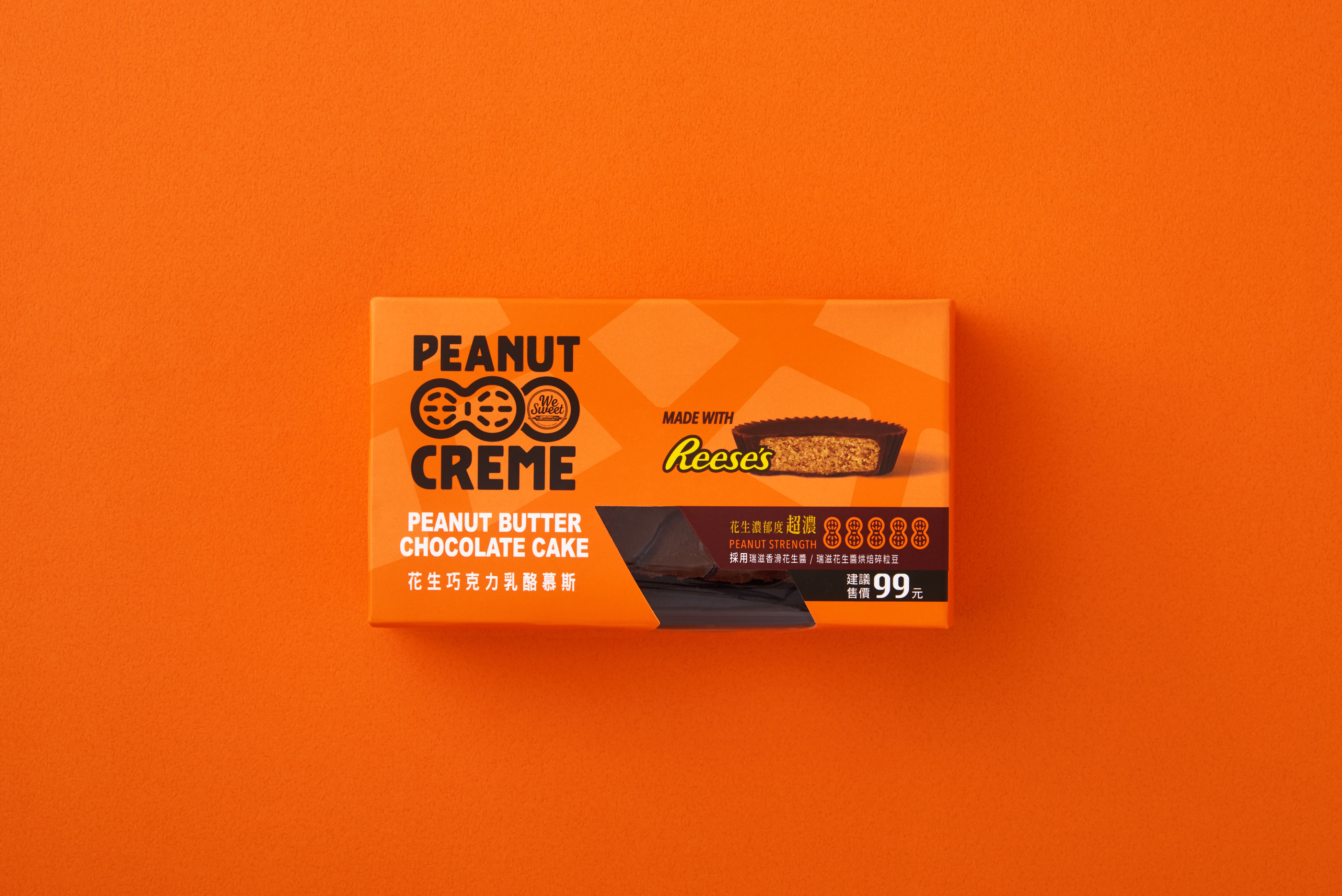
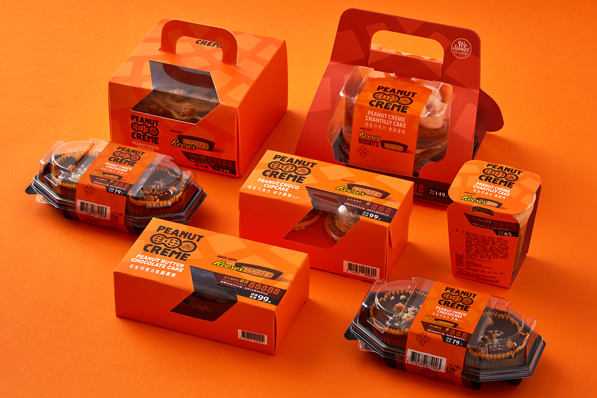
全聯甜點品牌 We Sweet 攜手美國知名花生醬《Reese’s》合作,推出系列甜品,包裝方面以花生醬與巧克力的多層次口感,進行色調與圖像的創作,並巧妙將烘焙碎粒豆的意象融入其中,營造美味的經典美式風格,表達出《 Reese’s》 花生醬給人輕狂熱情的甜膩感受。
MEMES designs the packaging design of the co-branding desserts of We Sweet and Reese's. The design uses the signature color of Reese’s and adds the image of multi-layers of chocolate and peanut butter with a roasted peanuts sketch to represent these rich multi-layered texture desserts. Also, this classical American style design shows the passion and sweetness of Reese’s.
今回、We Sweetはアメリカの人気商品ピーナッツバターブランドReese’sとコラボすることになりました。ピーナッツバターの滑らかさと濃厚なチョコのコンビネーションは絶妙です。パッケージのデザインにも勿論そんな風合いを表現しています。クラシッカルなブランドイメージに少し情熱なPOP感を足すことで客層を一段と広げる事を試みました。
- Client全聯福利中心
- Designer趙彥傑、黃鈺娟
- Creative Director趙彥傑
- 2020