Packaging Design – Tenno Rice 御皇米 米製品包裝設計
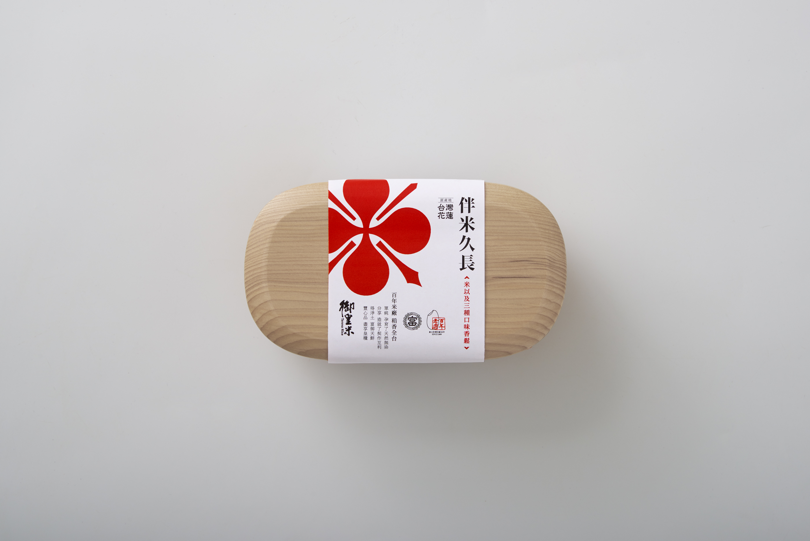
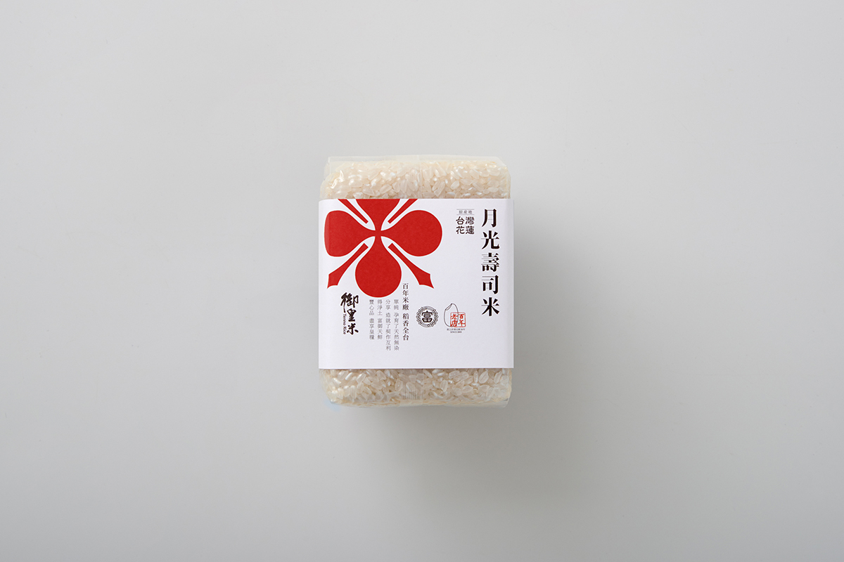
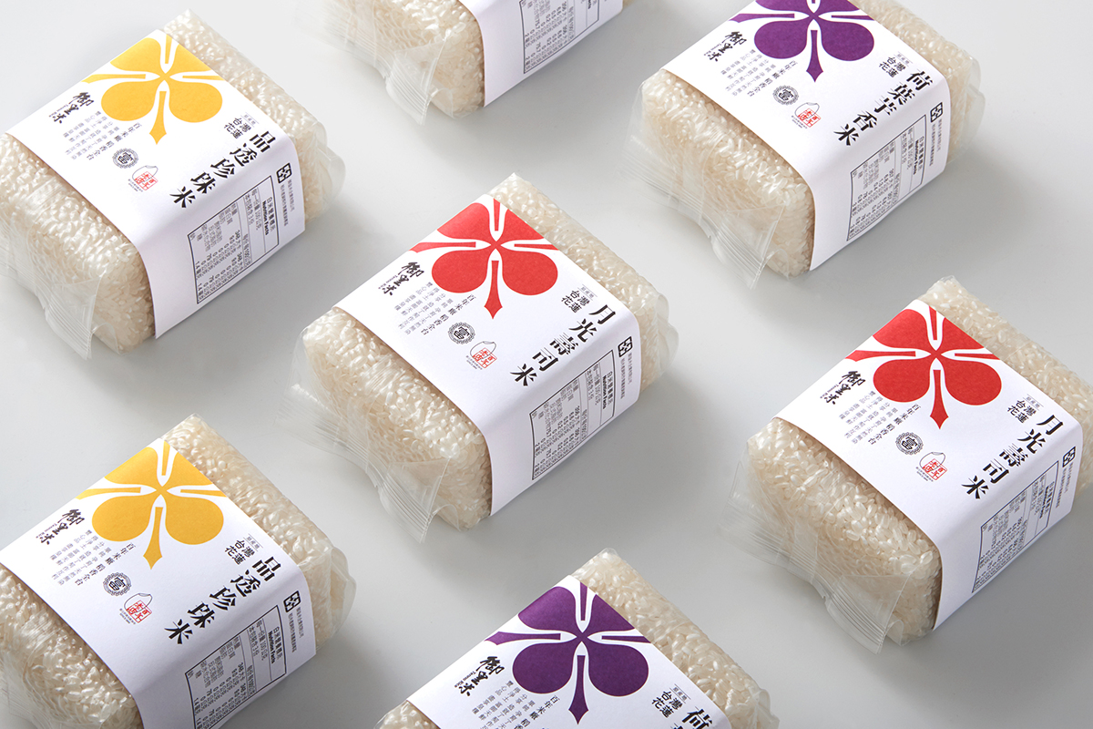
替擁有百年歷史的台灣稻米品牌《御皇米》 量身打造新的包裝視覺,以「米」為型,咀嚼百年文化,淬釀出如日本家徽般的莊重標誌,同時梳理近16種米類產品,統整品牌包裝視覺,替品牌未來的行銷需求奠定基礎。
MEMES designs the packaging design for Tenno Rice, a century-old rice manufacturer. The shape of the packaging is designed as a grain of rice with a dignified Japanese family crest image to represent its long history and culture of Tenno Rice. MEMES also integrates all 16 rice packaging to develop a more distinct brand identity for Tenno Rice in the market.
百年歴史を持つ台湾老舗「御皇米」のイメージ向上デザインプロジェクトです。
お客様の企業歴史をしっかり把握し、思案の段階から叩き込み、時代と共に鮮やかに輝くロゴのデザインを提案させて頂きました。同時に16種類もあるお米商品を分類、統合することも提案し、将来的にはマーケティングマネジメントもしやすくなったとお客様から評価を頂いております。
- Client御皇米
- Designer趙彥傑
- Creative Director趙彥傑
- 2020